Branding update for Darice, a craft supply wholesaler. With literally thousands of products and hundreds of micro-themes, the branding needed to be streamlined and updated, communicating quality and value. Monochromatic color freshened the line, putting all eyes on the product and allowing for easier cross-merchandising.
Renee Froerer, Creative Direction | Thomas Dang, Graphic Design
![](https://pro2-bar-s3-cdn-cf4.myportfolio.com/9f9b8724692ef31677423ebf6f555057/578830e3-e25c-427d-aacb-d60547c5a59d_rw_1200.jpg?h=68382eb00061b5307de093c59b98374e)
![](https://pro2-bar-s3-cdn-cf3.myportfolio.com/9f9b8724692ef31677423ebf6f555057/418da745-1fa4-4409-8c8e-c417a9baceee_rw_1920.jpg?h=ef8e354fc1cadbb0d34704301998ea91)
![](https://pro2-bar-s3-cdn-cf4.myportfolio.com/9f9b8724692ef31677423ebf6f555057/5f435ae0-3346-4870-8579-c77c52591044_rw_1920.jpg?h=6124bd9a19ca38fa8abeb3a96a831af1)
![](https://pro2-bar-s3-cdn-cf2.myportfolio.com/9f9b8724692ef31677423ebf6f555057/dda63d9b-62d6-478e-8b56-07cd8a2a98aa_rw_1200.jpg?h=679cfeacaed43914915fab69cc1ce294)
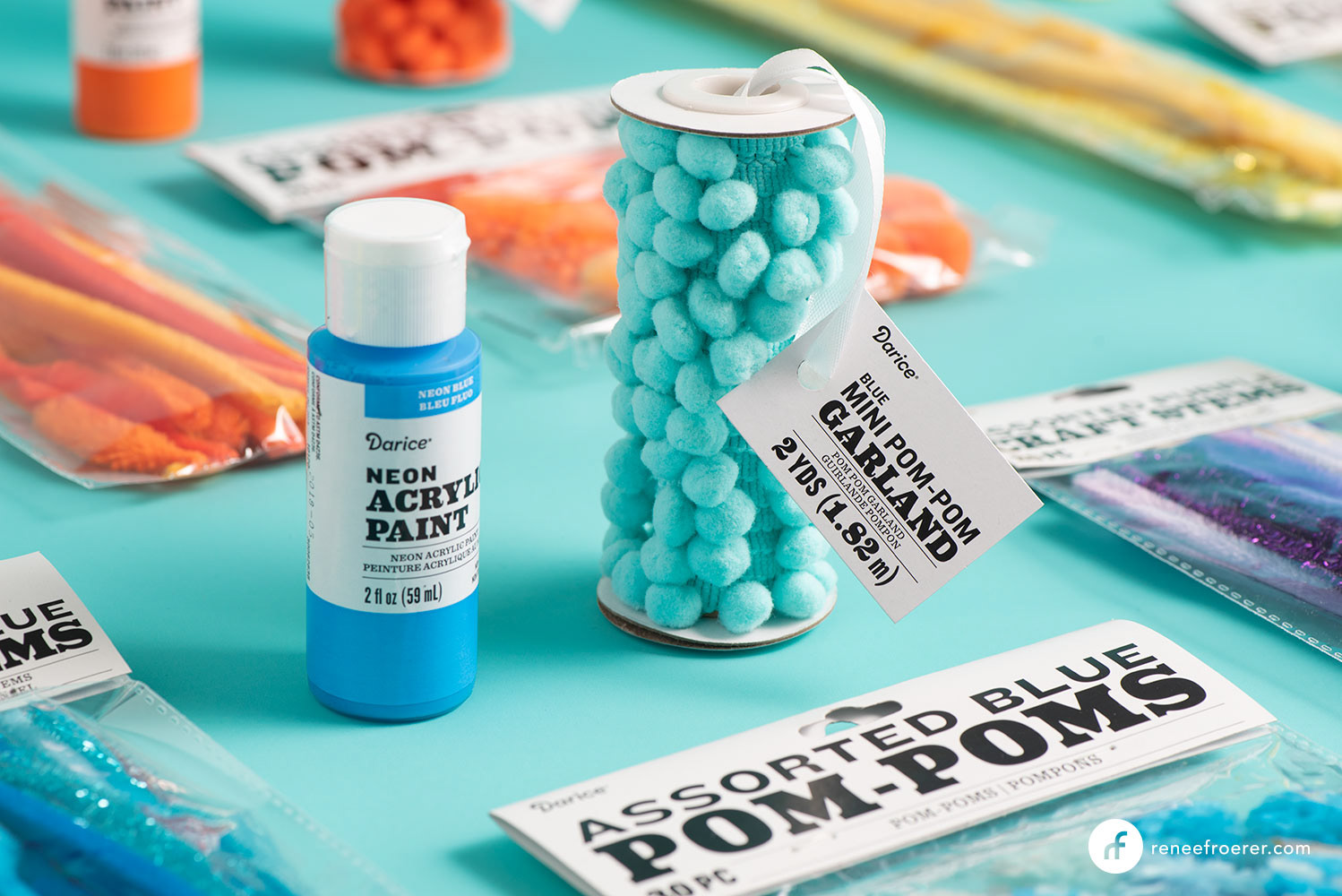
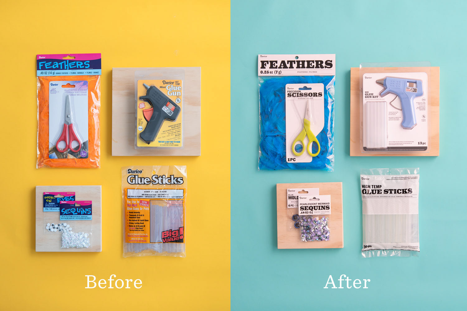
A sampling of before and after packaging samples. Updated typography gives the product category greater legibility at point of purchase. Black and white communicates value and lets the product shine.
![](https://pro2-bar-s3-cdn-cf1.myportfolio.com/9f9b8724692ef31677423ebf6f555057/cb0f4e36-ef48-4d87-8e59-1928ac5f4231_rw_1920.jpg?h=aebae9c3d776a34729fd66560c041a31)
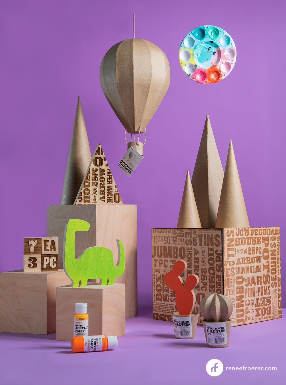
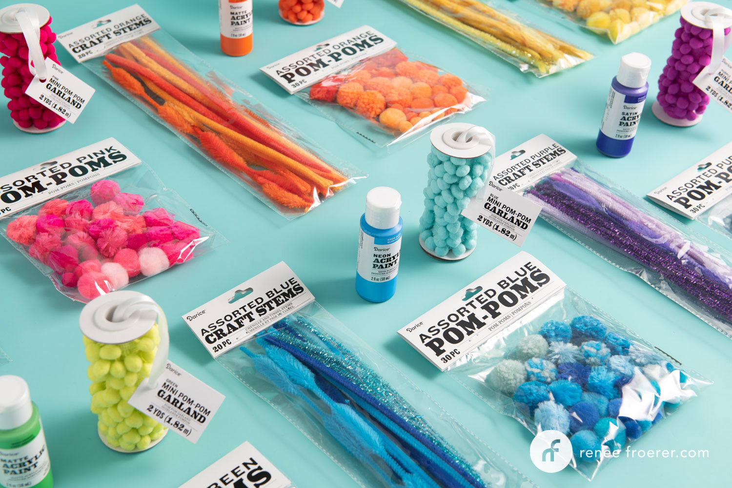
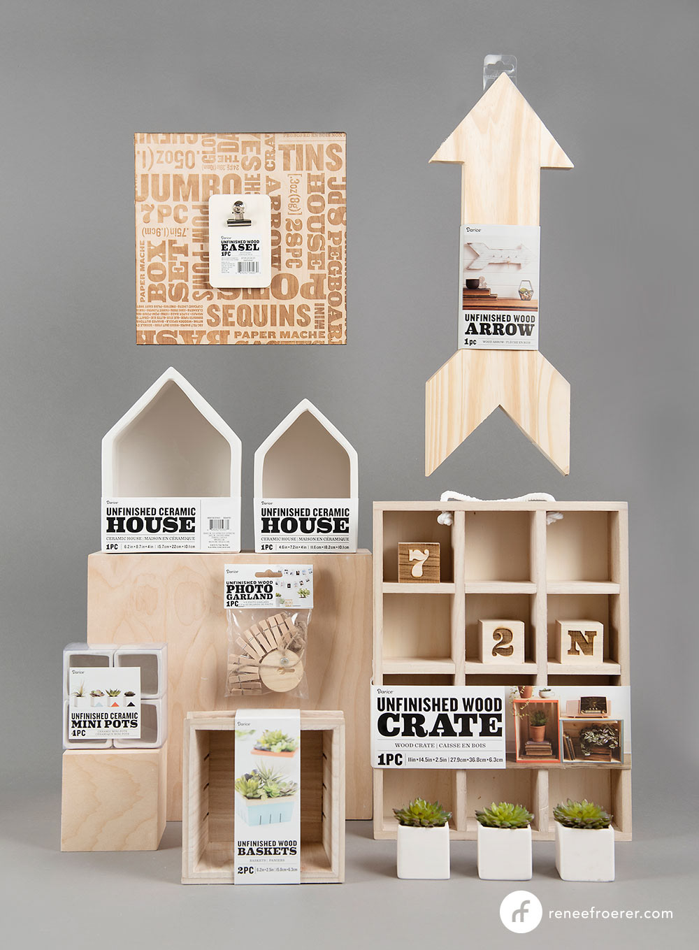
The surfaces line is similar to the basics line, with the addition of finished surfaces photography.
![](https://pro2-bar-s3-cdn-cf1.myportfolio.com/9f9b8724692ef31677423ebf6f555057/93c7569f-93cc-4828-863a-8601b1218054_rw_1200.jpg?h=763b2350124b53fbd32a648808aef631)
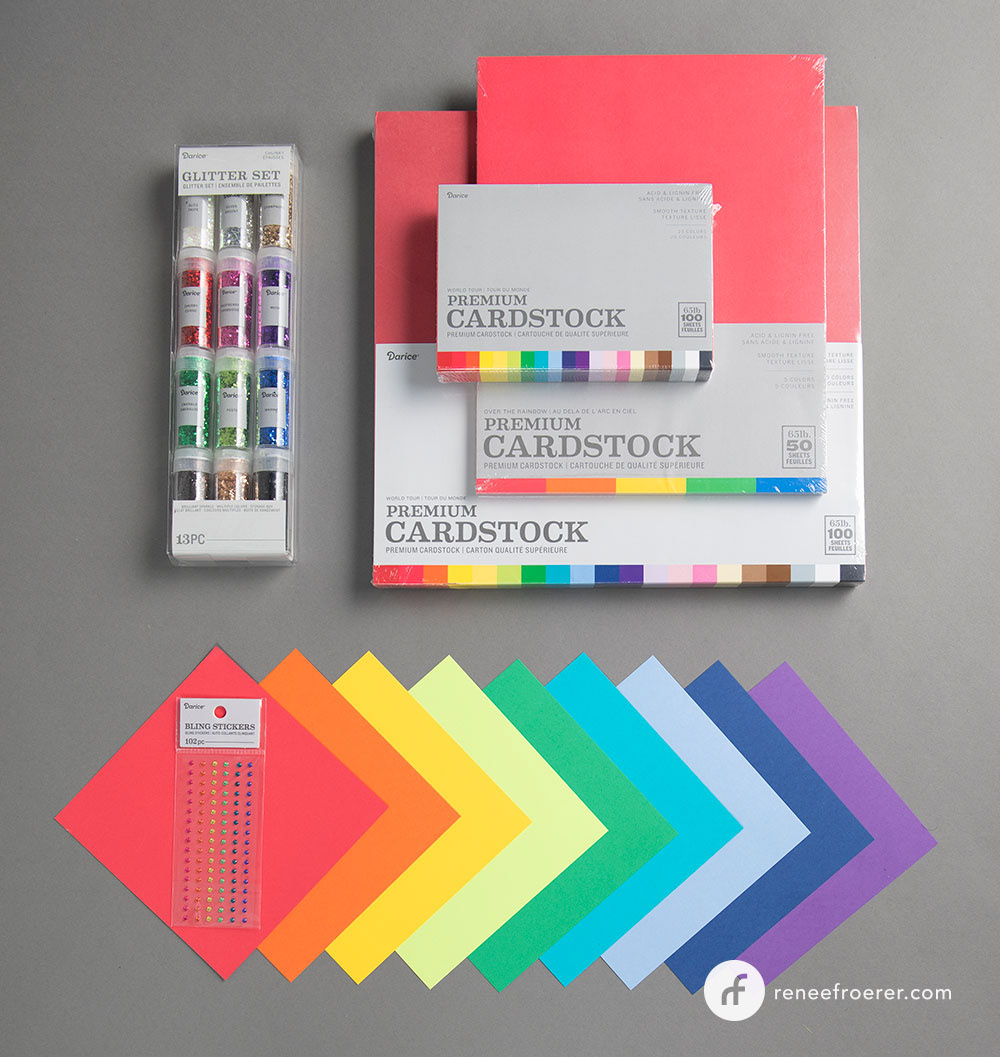
Papergoods were given a softer look, more appropriate for the core customer. A neutral gray palette highlights the colorful product and updated typography puts the product category front and center.
![](https://pro2-bar-s3-cdn-cf4.myportfolio.com/9f9b8724692ef31677423ebf6f555057/f8111c4b-1c47-4f47-9f50-6731078a436c_rw_1200.jpg?h=8e147d5308b427eab28b4be74f75e126)